[If you really hate reading, scroll to the bottom and watch
the video.]
A few years ago I began trying to find ways to share what I
was learning about the social injustice of our current distribution of wealth,
both in terms of income and in financial asset ownership. I learned that the
gap is much larger than most people realize. But this is math and people just
don’t get math. What I needed was some kind of visual way to show people how
unjust our current distribution of wealth really was.

What I was looking for was a normal distribution curve for
income or financial asset ownership. Many of you have seen a normal
distribution curve and I have posted an image of one on this blog. The problem
is that income distribution is not “normal”. In other words, there isn’t
something like a middle class.
It isn’t uncommon to use phrases like “average family
income” or “typical family income” but the more meaningful expressions when
evaluation a population are “mean”, “median” and “mode”. Of the three
expressions, the most important one is the one most often unlabelled, the mode.
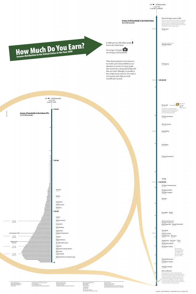
This poster attempts to plot households on a line that
represents income. The graphic on the left represents 99% of households. As you
can see from the graphic on the right, the top 1% earns so much more than the
other 99% that it is impossible to represent the bottom 99% on the same line as
the top 1%.
If you zoom in, you will find that the mean (same as
average) household income in 2000 was $57,000. This poster was developed in
2004 and is severely out of date, but it is still one of the best ways to
understand income distribution as expressed on a curve.
The statistically or mathematically challenged mind images
that half of the population earns less than $57,000 and half earns more and
that this is a typical annual earning for households with most families earning
a little less or a little more than $57,000. Nothing could be further from the
truth!
The median household income in 2000 was $40,700. Median is
the word that describes the half-way or middle point in the population. Half of
the households in 2000 earned under $40,700 and half earned more.
But we still haven’t discovered what is “typical”. The
highest point on the curve is the “mode”. In the language of statistics, this
is the closest thing you will find to typical or normal as these words are used
in everyday language. It should be apparent to anyone looking at the curve that
the typical household income in 2000 was roughly $20,000 to $22,000. Even more
alarming are the large number of people who earn $0. Most curves fail to
represent the lowest income earners.
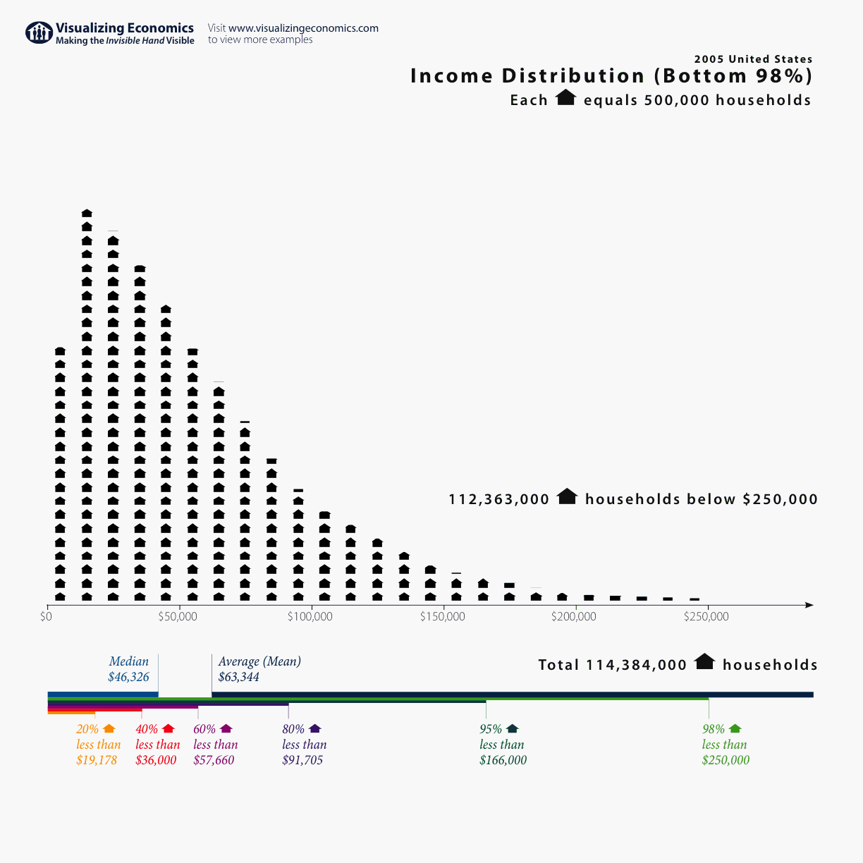
Here is a smaller version of the same illustration brought up to date in 2005. This chart only attempts to visualize the bottom 98%. Notice how far to the left most of the population is.

As lovely as this poster and these charts are, they still haven't captured the incredible social injustice of income and distribution. I
wanted something better. Then I found it! This was the graphic that I
would share with everyone and they would surely get it. I have posted the image
on this blog.

The data for this image was captured in 2008 by researchers
at the University
of California Berkeley United
States to see this graphic and to let it
sink in. The average amount of income received by the bottom 90% is represented
by the small blue dot in the lower right hand corner. The top 1%, 0.1% and
0.01% receive so much more income on average than the bottom 90% that it is
difficult to graphically represent them.
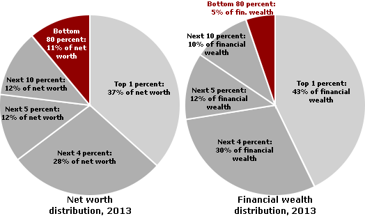
But wealth distribution is even more unequally concentrated at
the top than income distribution! Probably the best work on this subject to be
found anywhere on the Internet is the fruit of researchers at the University of California
at Santa Cruz
under the title of “Wealth, Income, and Power”.
This research is current to the year 2010 and examines
wealth distribution as both net worth and financial wealth. In the pie chart we
see that the bottom 80% share only 5% of the financial wealth while the top 1%
share an amazing 42% of the financial wealth. As strikingly small as this
percentage is, it totally fails to capture how incredibly small the percentage
of financial wealth held by the bottom 40%, 20% or 10% is and how unbelievably
disproportionate the percentage of financial wealth held by the top 0.1% or
0.01% is.
Furthermore, almost every effort to graphically represent
wealth and income distribution fails to reconcile the difference between what
we commonly believe to be the “ideal” distribution, what we “estimate” the
distribution to be, and what the “actual” distribution is.
We have finally arrived at what everyone must see! The
video that is posted at the end of this blog is the best single explanation of
how different the “actual” distribution of wealth is from our “estimated” or
“ideal” distribution that I have ever seen and I want everyone in the whole United States
to see it.
No comments:
Post a Comment