Thursday, March 21, 2013

Tier One vs Tier Two


This is not going to be one of my favorite articles because I really hate to criticize organized labor at a time when the institution seems to be under attack by so many. Organized labor is the only way that most working class people will ever have a strong voice in the negotiation for pay, benefits and work conditions. Organized labor is democracy in the workplace and whether it is perfect or not it is the best we have at the moment.

I know a lot of working class people who really dislike the labor organization that represents them and it isn’t difficult to understand why. Organized labor has its roots in the social justice movement but frequently fails to seek social justice for anyone outside of its tier one membership.

I have never been a member of a labor union, but my wife is a member. Let me be very clear that she is tier two labor; she is a part-time, low-wage, minimal benefits employee in a grocery store where she has worked for eight, going on nine, years. She has NEVER felt that her labor union represented her or cared about her. She has LITERALLY been told by her union representative that if she wants the hours, pay, and benefits that are in her union contract terms to be fully enforced she needs to “fight” for her hours and “fight” for a full-time position.

Half of the members of her union are part-time employees like my wife, they are all tier two and they know it. The store where my wife works has far more than half of its employees part-time. You might think that part-time employees exist because the employer is a tough negotiator, but I am thinking there is another reason.

The union contract is being renegotiated and they will be voting on it tomorrow. I went through the changes with my wife this afternoon and it was quickly apparent to me that the part-time employees were being tossed under the bus to maintain pay and benefits for the full-time employees.

This phrase caught my eye, “scheduling opportunities for part-time employees to maximize hours”. But what does it mean? It means that part-time employees will have to accept changes that exploit them so that full-time employees will be able to keep their stable paycheck. Part-time employees with seniority will see their work weeks reduced from 32 hours to 28 hours and their work days reduced from 8 hours to 6 hours so that full-time employees can get regular 40 hours weeks with 8 hours days.

Maybe we need to revisit what capitalism is to understand the problem with tier one vs. tier two employees? Capitalism is the social, political and economic system that elevates some to the top (Latin caput) by exploiting others who sink further toward the bottom. That is what maximizing the use of part-time employees does for full-time employees! It makes the part-time employee the servant of the full-time employee and the system where some exist to be servants to others is call conservatism.

I’m just saying … maybe it isn't her employer that is negotiating away my wife’s hours for its benefit, maybe it is her labor union leadership that is negotiating it away for the benefit of tier one members.

They need to conclude this contract by the end of the month so that the provisions of so-called Right to Work laws will not affect the contract. If this contract is not approved by the end of the month, a great many tier two union members will not feel inclined to pay for their union membership. They know they are not being represented and that they are being exploited for the benefit of tier one members.

It’s all about tier one!

Wednesday, March 20, 2013

100 Democrats Vote against the Back to Work Budget


This is the third year in a row that I have watched the majority of the Democrats in Congress line up and vote against the budget proposed by the Congressional Progressive Caucus. The Back to Work Budget was offered as a substitution to the Ryan Plan.

I understand why all the Republicans voted against it; they voted against it because … well, because they are Republicans. But I don’t understand why 100 Democrats voted against it.

I want to know what part of the Back to Work Budget these so-called Democrats objected to!

Was it the 7 million new jobs that it would have created in the first year by investing in infrastructure, education, aid to states, making work pay, funding emergency unemployment compensation and public works job programs and aid to distressed communities?

Maybe it was the fair individual tax provision that would have allowed Bush era tax cuts to expire for families earning over $250 K? The higher tax rates for millionaire and billionaires (from 45% to 49%)? Or the provision to tax income from investment the same as income from wages?

It could have been the fair corporate tax provisions that end corporate tax bias toward moving jobs overseas enact a financial transactions tax and reduce deduction for corporate jets, meals and entertainment?

Or was it the reduction in military spending to 2006 levels and focusing on modern security needs?

Did these Democrats object to the part that protected Medicare, Medicaid and Social Security from benefit cuts? How about the part that reduced healthcare costs by adopting a public option, negotiating drug price and reducing fraud?

Don't these Democrats want to protect the environment? Do they object to prices on carbon pollution with a rebate to hold low income households harmless? Don’t they want to eliminate corporate tax subsidies for oil, gas and coal companies?

The Progressive Democrat Caucus budget would have reduced the budget deficit by $4.4 trillion and was projected to increase the GDP by 5.7%; is that what the Democrats objected to?

I just want to know why 100 Democrats thought that the Ryan Plan was better than Back to Work Plan offered by the Progressive Congressional Caucus.

Click here for Analysis of the Congressional Progressive Caucus budget for fiscal year 2014 produced by the Economic Policy Institute Policy Center.

Banking 101


I have been impatiently waiting for the folks at PositiveMoney to finish a short series of videos on banking in the United Kingdom called Banking 101. There are probably more than a few differences between banking in the United States and in the United Kingdom, but the most significant difference is whose faces are printed on the notes.

Most of the western nations have money systems that bring money into existence in the same manner as this video series explains. I don’t know of any short series of videos that explains money and banking  in the United States as concisely as this series does using the banking system of the United Kingdom as the example.

I wanted to make my own videos on the subject, but sadly discovered that I lack the talent to do so. Please take a few minutes and watch these videos to learn about banking and money creation.


Thursday, March 7, 2013

Is the phrase “Typical Household Income” obsolete?


Is the phrase “Typical Household Income” obsolete?

It has for several generations now been well understood what was meant by phrases like “middle income”, “working class” and “typical household” to describe what I believe does not exist. I just reviewed a Congressional Research Service (CRS) report entitled “The Distribution of Household Income and the Middle Class” (November 13, 2012) and the conclusions presented in the report about the range of incomes that might make a household “middle income” where absurd to the Nth degree.

I recently wrote about three statistical terms that are relevant to this discussion: median, mean and mode. Consider carefully the estimated income distribution graph below which is based on census data gathered in 2010.


Mean (Average Household Income)

The average household income in 2011 was $69,677. The words “average” and “mean” are synonyms; the mean the same thing (pun intended). But nearly 2/3rds of the households earned less than the mean income, how could this be the “middle” or “middle class”?

Median (the “Middle”)

The middle point in any statistical population is what is called the “median” and median income in 2010 was $49,445; in 2011 it was $50,054. The middle quintile (1/5th or 20%) of in households in 2011 earned between $38,521 and $62,434. The “mean” or “average” income that was just mentioned is not even in the middle quintile!

The CRS report concluded that this range was too “narrow” and could not “account completely for those commonly considered to be middle class.” The report went on to suggest that 2nd, 3rd, and 4th quintiles together might be “middle class”. The range of these three quintiles together is from $20,263 to $101,583.

Is it even possible that the top of the middle class is roughly FIVE TIMES what the bottom of middle class is? Households earning $20,000 are NOT in the same income class as households earning $100,000!

Mode (Typical Household Income)

If any statistical point on the income distribution curve could be properly regarded as “typical” for “working class” households, it would be the “mode”. The mode is the highest point in the curve; it is the point where the largest portion of the population is measured; it is point where any given household is most likely to fall.

The mode in 2010 was between $15,000 and $19,999 at just over 6%. The modal point in 2011 was somewhat more complicates; many people in the modal range lost their jobs so the new mode was split with 5.9% falling in the $10,000 to $14,999 range and 5.9% in the $20,000 to $24,999 range. Is this “middle income”, $10,000 to $24,999?

Perceptions Do NOT Match Reality

Surveys indicate that the population considers a much higher range of incomes to be “middle income” than is indicated by statistical analysis. A Pew Research Center study concluded that the middle income range might be from $30,000 to $99,999. But you are roughly THREE TIMES as likely to have a household income between $15,000 and $19,999 (6%) as to have a household income between $95,000 and $99,999.

Surely we all know that typical, working class, middle income families do not earn incomes approaching $100,000? Apparently not! In the same study, 46% of the households with incomes of $100,000 or more self-identified as “middle class”.

Rethinking Typical, Working Class and Middle Income Households

Shouldn’t middle income be someplace near the middle? Shouldn’t typical be the income range that any given household is likely to fall into?

Maybe people living in a household with greater than $50,000 (the median) should look over their shoulder and see that the big bump in the curve is someplace between $15,000 and $24,999? The typical working class person is nowhere near the middle.

Maybe people living in a household approaching $100,000 should look over their shoulder and see that the middle is roughly half of their income level, roughly $50,000. Managers, professionals and even many teir-1 laborers are not really close enough to the middle to call them selves middle income.

Confucius said, “The beginning of wisdom is to call things by their true names.” There should be no shame in being successful and earning a dignified wage, but it is very important to recognize the actual fact that you may no longer be typical, working class, or middle income.

The typical, working class or middle income person is essentially a wage slave and is dependent upon social programs such as food stamps, Medicaid, Medicare, Pell Grants, Social Security and tax credits. Any thought of reducing these subsidies to the growing population of working poor people are unconscionable.

Obscene Wealth Has Reduced Typical, Working Class People to Poverty

To make a few people obsenely wealthy, many … no, most … people must be insecure and poor. Many conservatives imgine themselves to be numbered amoung the wealthy because they are so much better off than the majority of the people they know, but their relative wealth is NOT the cause of wide-spread poverty in the typical, working class households.

That being said, it isn’t helpful that so many people who enjoy household incomes aproaching or in excess of $100,000 regard themselves as a class appart from the majority of the people whose incomes are so much lower. Or that the relatively wealthy people often work only to protect their own wealth even when doing so injures others with lower imcomes.

Wealth Inequality in America – A Viral Video That You MUST Watch!

An unknown YouTube subscriber known only as Politizane has posted a video that has gone viral on the Internet. This video has over 3,520,683 views since it was posted November 20, 2012.

This video presents infographics on the distribution of wealth in America, highlighting both the inequality and the difference between our perception of inequality and the actual numbers. The reality is often not what we think it is.

If you haven’t seen the video yet, watch it now. I promise you that no matter what you currently think of wealth inequality in America, you will have to revise your thoughts after watching it.


Everyone Must See This Video!


[If you really hate reading, scroll to the bottom and watch the video.]

A few years ago I began trying to find ways to share what I was learning about the social injustice of our current distribution of wealth, both in terms of income and in financial asset ownership. I learned that the gap is much larger than most people realize. But this is math and people just don’t get math. What I needed was some kind of visual way to show people how unjust our current distribution of wealth really was.

What I was looking for was a normal distribution curve for income or financial asset ownership. Many of you have seen a normal distribution curve and I have posted an image of one on this blog. The problem is that income distribution is not “normal”. In other words, there isn’t something like a middle class.

It isn’t uncommon to use phrases like “average family income” or “typical family income” but the more meaningful expressions when evaluation a population are “mean”, “median” and “mode”. Of the three expressions, the most important one is the one most often unlabelled, the mode.

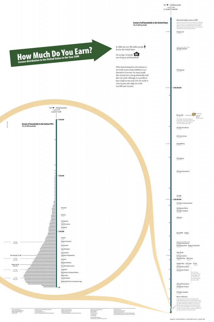
 The best way to understand this is to download and view a poster from VisualizingEconomics.com. I have posted a preview of the posted on the blog, click here to download the full size PDF.

This poster attempts to plot households on a line that represents income. The graphic on the left represents 99% of households. As you can see from the graphic on the right, the top 1% earns so much more than the other 99% that it is impossible to represent the bottom 99% on the same line as the top 1%.

If you zoom in, you will find that the mean (same as average) household income in 2000 was $57,000. This poster was developed in 2004 and is severely out of date, but it is still one of the best ways to understand income distribution as expressed on a curve.

The statistically or mathematically challenged mind images that half of the population earns less than $57,000 and half earns more and that this is a typical annual earning for households with most families earning a little less or a little more than $57,000. Nothing could be further from the truth!

The median household income in 2000 was $40,700. Median is the word that describes the half-way or middle point in the population. Half of the households in 2000 earned under $40,700 and half earned more.

But we still haven’t discovered what is “typical”. The highest point on the curve is the “mode”. In the language of statistics, this is the closest thing you will find to typical or normal as these words are used in everyday language. It should be apparent to anyone looking at the curve that the typical household income in 2000 was roughly $20,000 to $22,000. Even more alarming are the large number of people who earn $0. Most curves fail to represent the lowest income earners.

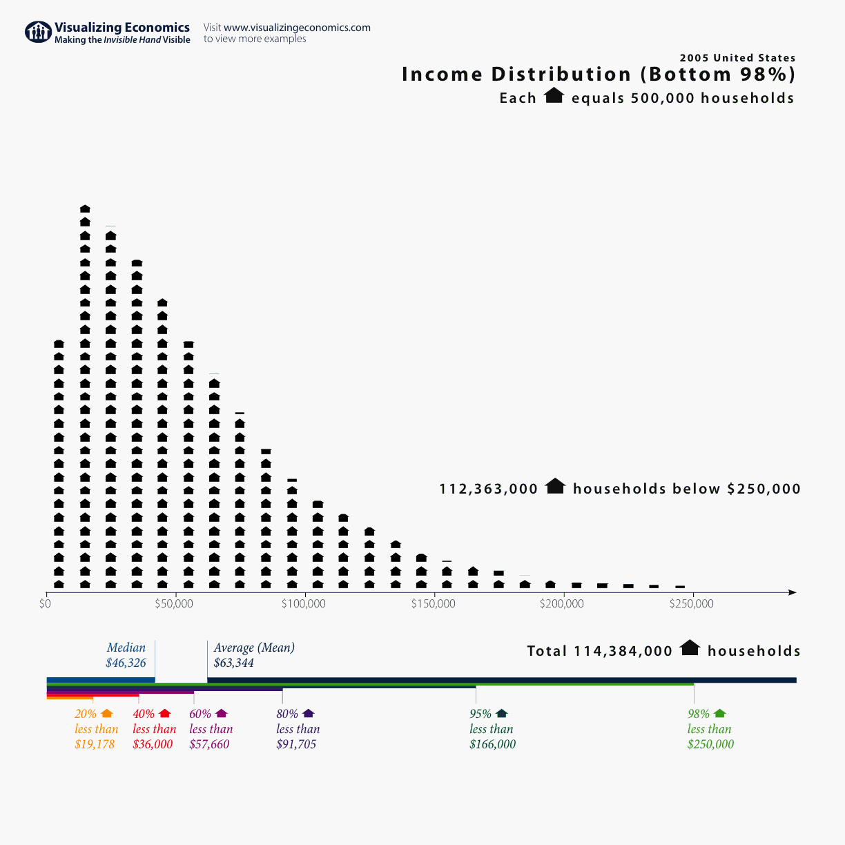
Here is a smaller version of the same illustration brought up to date in 2005. This chart only attempts to visualize the bottom 98%. Notice how far to the left most of the population is.


Here is yet one more visualization one more that was current in 2010. This chart attempts to visualize 100% of the population by lumping all incomes over $250,000 in the last column.


As lovely as this poster and these charts are, they still haven't captured the incredible social injustice of income and distribution. I wanted something better. Then I found it! This was the graphic that I would share with everyone and they would surely get it. I have posted the image on this blog.

The data for this image was captured in 2008 by researchers at the University of California Berkeley. I wanted every person in the United States to see this graphic and to let it sink in. The average amount of income received by the bottom 90% is represented by the small blue dot in the lower right hand corner. The top 1%, 0.1% and 0.01% receive so much more income on average than the bottom 90% that it is difficult to graphically represent them.


But wealth distribution is even more unequally concentrated at the top than income distribution! Probably the best work on this subject to be found anywhere on the Internet is the fruit of researchers at the University of California at Santa Cruz under the title of “Wealth, Income, and Power”.

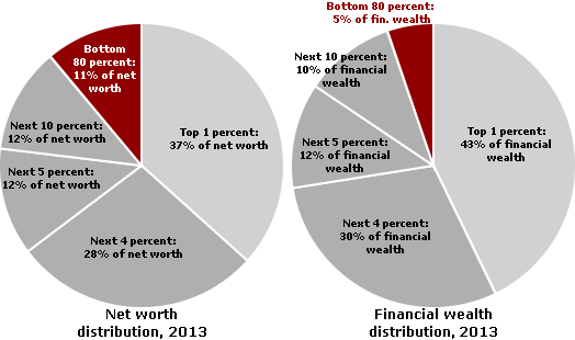
This research is current to the year 2010 and examines wealth distribution as both net worth and financial wealth. In the pie chart we see that the bottom 80% share only 5% of the financial wealth while the top 1% share an amazing 42% of the financial wealth. As strikingly small as this percentage is, it totally fails to capture how incredibly small the percentage of financial wealth held by the bottom 40%, 20% or 10% is and how unbelievably disproportionate the percentage of financial wealth held by the top 0.1% or 0.01% is.


Furthermore, almost every effort to graphically represent wealth and income distribution fails to reconcile the difference between what we commonly believe to be the “ideal” distribution, what we “estimate” the distribution to be, and what the “actual” distribution is.

We have finally arrived at what everyone must see! The video that is posted at the end of this blog is the best single explanation of how different the “actual” distribution of wealth is from our “estimated” or “ideal” distribution that I have ever seen and I want everyone in the whole United States to see it.